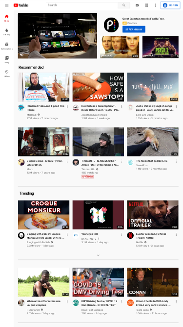
Full-Page Website Screenshots with Custom Viewports
Why Full-Page Screenshots Matter
Full-page screenshots are essential for accurately capturing the complete layout of a website as it appears across different devices. They provide a clear, comprehensive view of how your site looks to users, regardless of their screen size or resolution. This is crucial for web developers, designers, and marketers who need to present, analyze, or document website appearances in various contexts.
Adjusting the viewport to simulate different device screens helps in creating high-quality, accurate screenshots that reflect how your website performs on various devices. This is especially valuable for responsive design testing, marketing materials, and quality assurance.
Use Cases for Custom Viewports
Custom viewports allow you to tailor screenshots for specific devices and resolutions, providing precise visual documentation. Here are a few scenarios where this feature is particularly beneficial:
- Design and Development: Ensure that your website's design and layout are consistent across different devices and screen sizes.
- Marketing and Presentations: Create visually appealing and device-specific screenshots for reports, promotional materials, and client presentations.
- Quality Assurance: Verify that all elements of your website display correctly and function as intended on various devices before launch.
Default Viewport and Adjustments
The default viewport size is 1920x1080, which represents the typical Full HD (1080p) resolution for desktop screens. This resolution is widely used and ensures that your screenshots reflect common desktop experiences.
For more insights into popular screen resolutions, visit StatCounter, where you can explore statistics and filter by region or device type.
Screenshot Request Examples
Below are examples of how to request screenshots for various devices and resolutions:
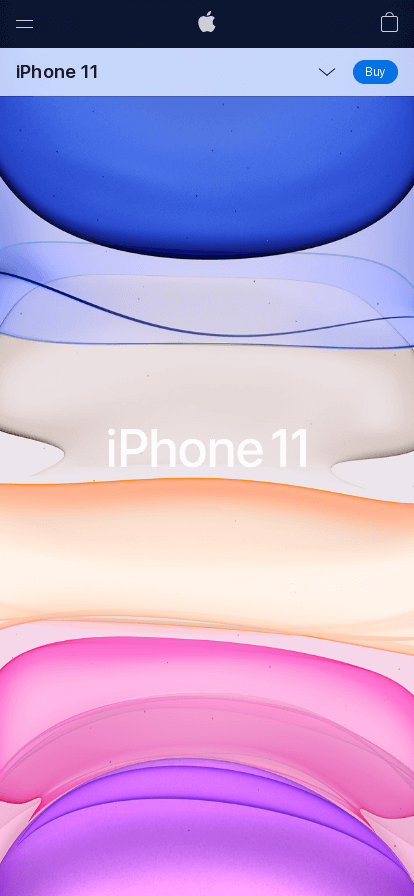
Mobile Device Screenshot (iPhone 11) - 414x896
To capture a screenshot with a viewport size of 414x896, simulating an iPhone 11:
// Example request for iPhone 11 https://api.addscreenshots.com/screenshots
?apikey=YOUR_API_KEY
&viewport=414x896
&url=https://www.apple.com/iphone11/
Your API key can be found on the API Keys page. Need an API Key? Sign up to get started.
For internal applications, replace YOUR_API_KEY with your own unique API Key.
For public facing websites or hotlinks, generate a signed URL.
Tablet Screenshot - 768x1024
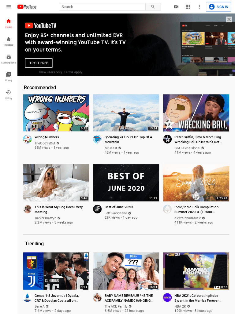
For a tablet-sized screenshot with a viewport of 768x1024:
// Example request for Tablet https://api.addscreenshots.com/screenshots
?apikey=YOUR_API_KEY
&viewport=768x1024
&url=youtube.com
Small Desktop Screenshot - 1024x768
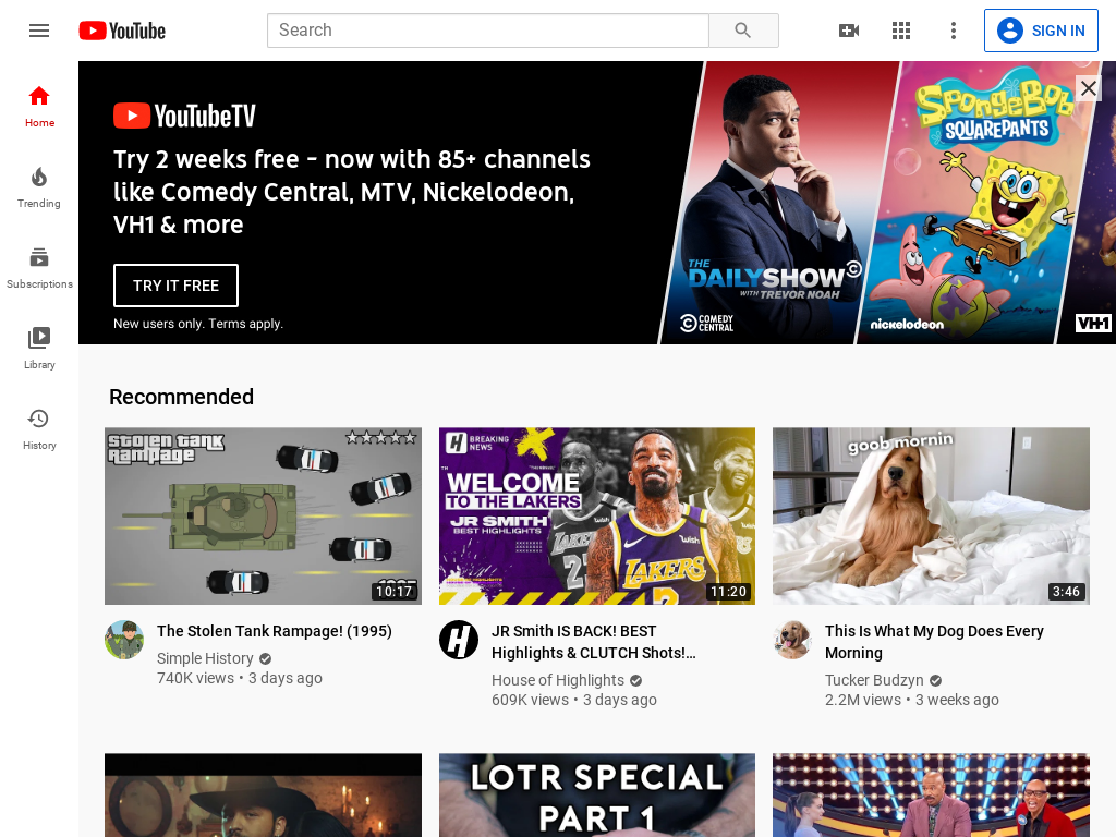
To capture a screenshot with a smaller desktop viewport of 1024x768:
// Example request for Small Desktop https://api.addscreenshots.com/screenshots
?apikey=YOUR_API_KEY
&viewport=1024x768
&url=youtube.com
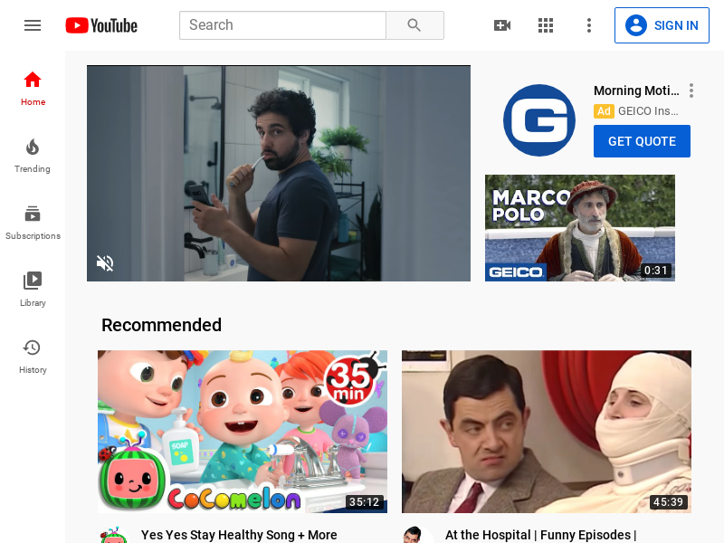
Tiny Desktop Screenshot - 800x600
For a tiny desktop viewport of 800x600:
// Example request for Tiny Desktop https://api.addscreenshots.com/screenshots
?apikey=YOUR_API_KEY
&viewport=800x600
&url=youtube.com
iPhone 6, 7 & 8 Screenshots - 375x667
To capture a screenshot mimicking iPhone 6, 7, or 8 with a viewport of 375x667:
// Example request for iPhone 6, 7 & 8 https://api.addscreenshots.com/screenshots
?apikey=YOUR_API_KEY
&viewport=375x667
&url=youtube.com

// Example request for optimized mobile screenshot https://api.addscreenshots.com/screenshots
?apikey=YOUR_API_KEY
&viewport=375x667
&mobile=true
&url=youtube.com
