Mobile and Tablet Web Screenshots for Enhanced Optimization
Efficiently capture mobile and tablet website screenshots with Add Screenshots' versatile tools. Optimize your screenshots across various devices by view content for mobile and tablet users.
Mobile devices often present unique challenges for website rendering, with their narrower screens and differing resolutions. By utilizing the mobile setting feature, you can ensure that your website appears as intended on smaller screens, enhancing accessibility and user engagement.
For instance, when rendering a webpage designed for desktop viewing on a mobile device, the viewport meta tag adjusts the page's dimensions to fit the smaller screen size, ensuring a seamless browsing experience for mobile users.
Setting the mobile parameter to true, will use the viewport meta tag for pages that are optimized for media queries.
Default Mobile Setting
The default mobile is false, which works well for desktop and tablet website or websites that are not optimized for mobile devices.
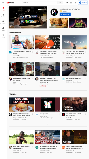
Screenshot Example - Mobile Disabled
// Line breaks added for readability
https://api.addscreenshots.com/screenshots
?apikey=YOUR_API_KEY
&viewport=375x667
&mobile=false
&url=youtube.com

Screenshot Example - Mobile Enabled
// Line breaks added for readability
https://api.addscreenshots.com/screenshots
?apikey=YOUR_API_KEY
&viewport=375x667
&mobile=true
&url=youtube.com

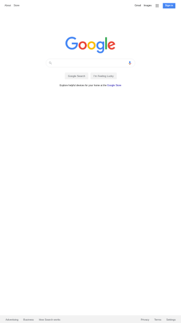
Screenshot Example - Mobile Disabled
// Line breaks added for readability
https://api.addscreenshots.com/screenshots
?apikey=YOUR_API_KEY
&viewport=375x667
&mobile=false
&url=google.com

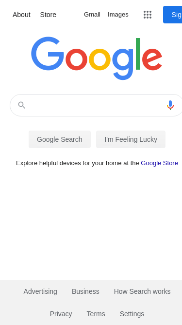
Screenshot Example - Mobile Enabled
// Line breaks added for readability
https://api.addscreenshots.com/screenshots
?apikey=YOUR_API_KEY
&viewport=375x667
&mobile=true
&url=google.com
